
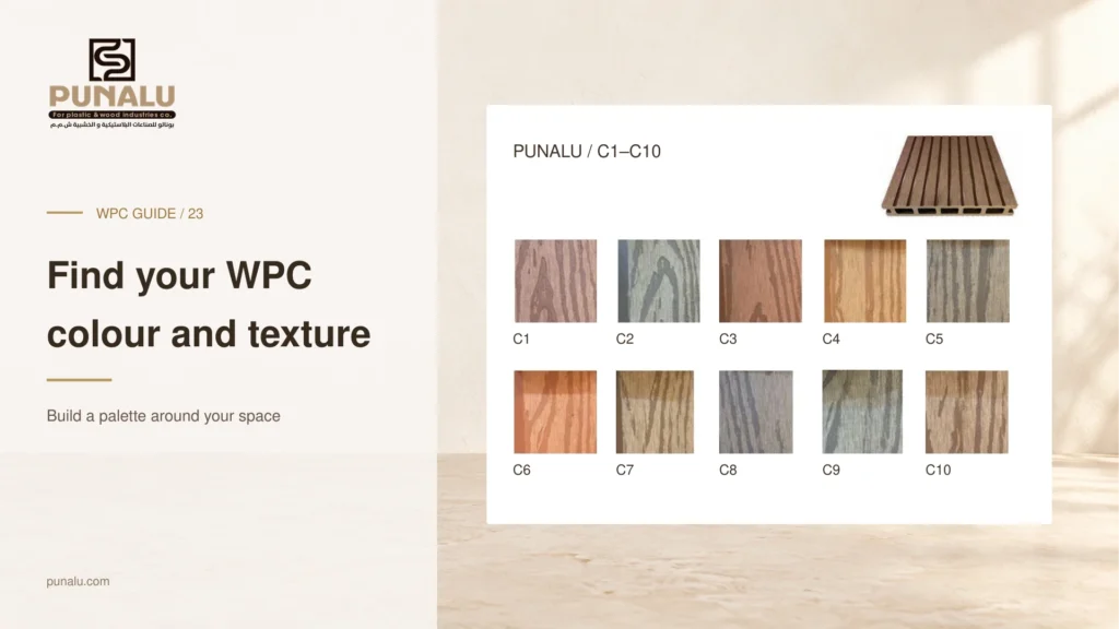
The right WPC colour should work with the whole project, not only look attractive as an isolated sample. A board that appears balanced in a showroom can feel very different beside a cream façade, dark aluminium frames or cool grey paving. Texture, board direction and lighting also influence the finished impression.
This guide offers a practical method for choosing WPC colours and textures without turning the process into an endless search through photographs. Start with the elements you cannot change, reduce the options to a small set and make the final decision using physical samples in the intended space.
PUNALU publishes a catalog color chart with references C1 to C10. Use those references to request a shortlist for the selected profile, then confirm current availability and the physical sample. The chart is a selection aid; it does not guarantee that every color is stocked for every product at the time of ordering.
Identify the fixed finishes first
List the major surfaces that will remain: walls, stone, door frames, glazing surrounds, pool coping and any large piece of furniture. Place photographs or samples of these finishes together. This creates a realistic context for the WPC rather than asking one board to look good against an empty background.
Identify the dominant tone. A space may already feel warm because of beige stone and bronze frames, or cooler because of grey paving and black metal. You do not need to match that tone exactly, but recognising it helps you choose a deliberate relationship instead of an accidental clash.
If the WPC covers a large area, consider it one of the main finishes. A small colour difference becomes more noticeable when repeated across a broad deck or façade. Give that surface enough attention before finalising smaller decorative items.
Choose between continuity and contrast
A continuous palette uses related tones to create a quiet transition between surfaces. For example, a warm timber-like finish may sit comfortably beside sand-coloured stone and neutral furniture. The materials remain distinct, but the overall scene feels connected.
A contrasting palette makes the WPC more prominent. A darker finish against a pale wall can give a strong outline to a seating area or architectural element. Before choosing this approach, decide which surface should lead and which should support it. Several competing contrasts can make a small space feel visually busy.
Neither approach is automatically more luxurious. The successful choice is the one that supports the architecture and intended use. A simple palette with well-resolved edges often feels more considered than a complex arrangement of many similar wood tones.
Compare samples under the actual lighting
Request physical samples of a small shortlist and place them in the project location. View them beside the fixed finishes in morning light, afternoon light and any relevant artificial lighting. Avoid choosing solely from a phone screen, where camera exposure and display settings can change the impression.
Move the samples between sun and shade if both conditions occur in the space. Look from the main doorway and the normal seating position rather than judging only from a few centimetres away. The overall effect matters as much as the close-up grain.
Record the sample code and product name. A photograph labelled “brown option” is easy to misunderstand when several ranges use similar descriptions. Keep one approved reference sample available during delivery and installation.
Assess texture at two viewing distances
At close range, look at the surface pattern, grooves and level of visual variation. Then step back to see whether the texture reads as calm or busy across a larger area. A strongly expressed grain may be appealing on one sample but more dominant when repeated across the whole design.
Ask about the available faces and the intended orientation of the product. Do not assume that both sides of a board are approved as the walking or visible surface. Confirm the installation requirements before using a design idea that depends on reversing or rotating the profile.
Texture appearance should also be separated from performance claims. A surface that looks rough is not, by appearance alone, evidence of a particular slip classification. Where that performance matters, request the relevant product documentation.
Coordinate board direction and edge details
Colour cannot be assessed entirely separately from layout. The same finish can look more formal when aligned with the main architectural lines or more expressive when used in a contrasting direction. Sketch a few options using the actual board width and the location of joints.
Review the perimeter at the same time. Decide whether trims should visually blend with the boards or form a defined border, subject to the available compatible components. Ask to see a finished corner or a representative sample arrangement rather than approving the colour of the main board alone.
In small areas, reducing the number of visible transitions can help the design feel settled. In larger projects, a change in direction may help distinguish zones, but it should be coordinated with support and joint details before it becomes part of the order.
Include everyday use in the decision
Ask how the selected surface should be cleaned and what expectations apply to its appearance over time. Consider the real setting: dining furniture, plant pots, children’s activities or frequent movement of equipment. A finish is easier to live with when care expectations are understood before purchase.
For sunny outdoor spaces, discuss surface comfort and shade as part of the design. Do not treat a colour name or marketing photograph as a promise that the deck will remain comfortable for bare feet in every condition. A site sample review helps frame a more useful conversation.
Agree how delivered material will be checked against the approved selection and how any batch variation will be handled. Keep product codes and spare-material decisions in the order so that future maintenance is not based only on memory.
Frequently asked questions
Should the WPC match my interior wood flooring?
It can relate to it without being identical. Compare both with the threshold, frames and exterior finishes, then choose whether you want continuity or a deliberate transition.
Can I choose a colour from a digital catalogue?
Use the catalogue to make a shortlist. Confirm the final choice with a physical sample and the exact product code whenever possible.
Is a more textured surface always safer?
Appearance alone does not establish slip performance. Ask for the appropriate test information for the exact product and application when that criterion is important.
Build your shortlist with PUNALU
Share photographs of the project’s fixed finishes with PUNALU and ask about available WPC colours, textures and compatible accessories. Compare the shortlisted samples in the actual space, then record the approved product and colour codes. This turns a subjective preference into a selection that can be ordered and checked clearly.
Sources and product guidance
Use the selected product documentation. Other manufacturers’ guidance applies to their own products.